
Update: Here’s the video of my presentation
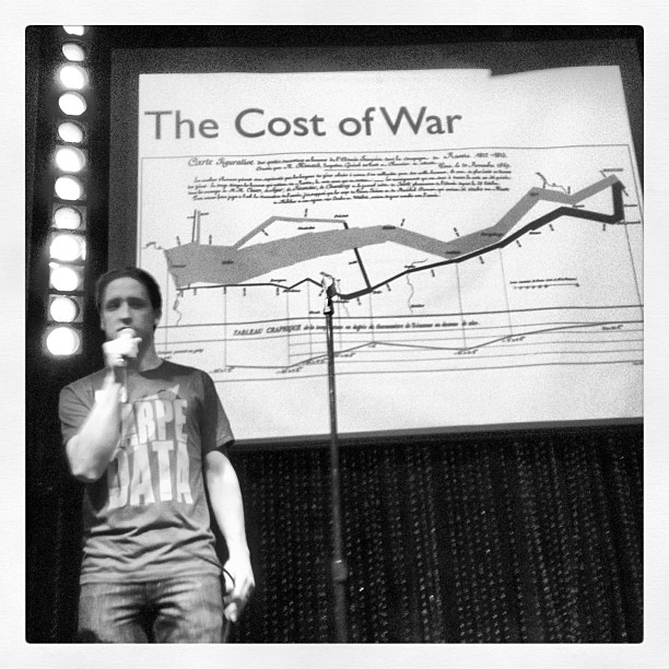
Last Thursday I gave a talk on Data Visualization at Ignite Philly 11. I was nervous as hell, but the encouragement you get from that crowd is amazing. The organizers (David, Geoff and Adam) did a great job and it could not have gone smoother.
Here are my slides with some additional commentary that doesn’t fit into 15 seconds.
First, a few fun facts about my talk:
- I never tested it in Powerpoint. I meant to, but I didn’t. I just wrote it in Keynote, exported it, and prayed it would look ok.
- The next day, James Miller complained on twitter how much he would have liked to have been there and didn’t realize there was a woman there chanting his name.
- I tried to put on one of Brett Mandel’s campaign tattoos before the presentation, but it wouldn’t stick, so I just used one of his giant stickers instead.
I tried to go for big problems in the talk. Earlier versions included a number of interesting sports visualizations, but in the end I felt they detracted from my overall thesis, but I snuck one into my opening slide which shows NL East games above 0.500 for 2007. See how far the Phillies were out of the race at the end of the season but ended up tied for first on the last day. They beat the Nationals that day 6-1 and the Mets fell to 2nd place. I use a version of this on my example page for evidensity.js.

The info about pre-math societies came from the excellent book Here’s Coming at Euclid by Alex Bellos. In chapter 0 he talks about how primitive societies make decisions without mathematics and why we eventually needed math. This slide also gave me a chance to post a picture of Phil Hartman’s Unfrozen Caveman Lawyer. RIP.
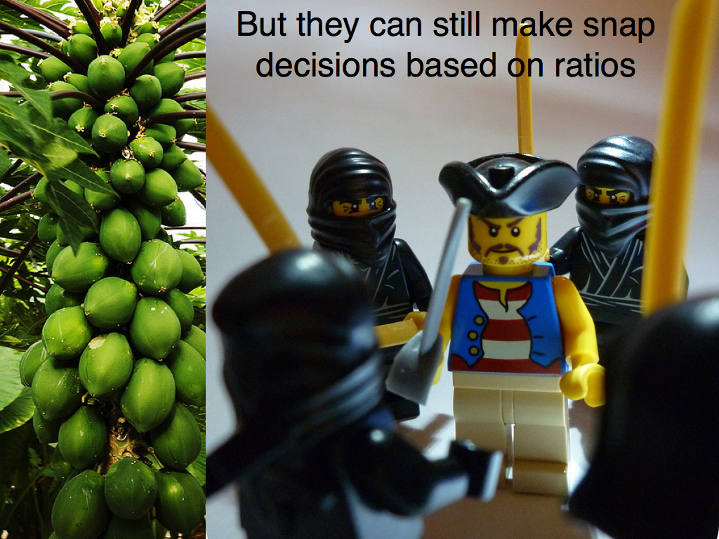 This was my least favorite slide and of course, it’s the one shown in most of the pics I’ve seen of my talk. It’s just a tree with fruit and a lego guy about to get jumped. I used it to represent why we need the ability to make quick decisions in the wild and I struggled with what to use here.

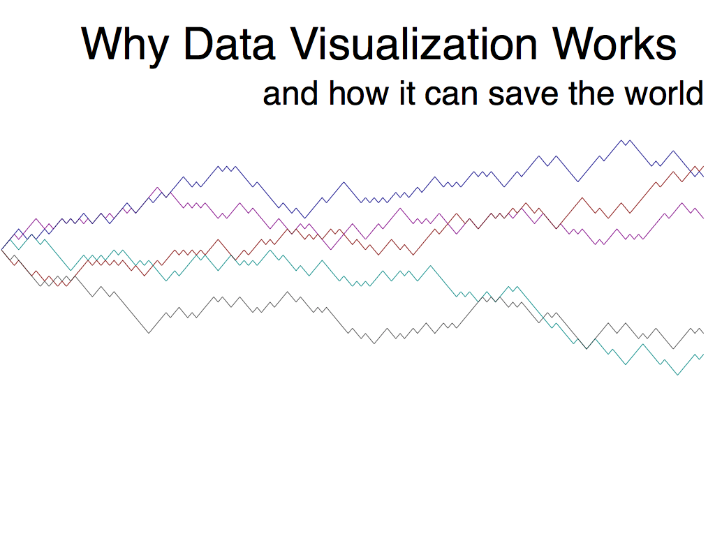
The 10-20Mbs figure comes from Ed Tufte and a UPenn study. Originally my talked was called, “How Data Visualization Works” and then I realized I didn’t have any idea of HOW it actually works. I only know WHY, because we’ve evolved over millions of years to make life and death decisions based on the ratios of visualized objects. So I changed it.
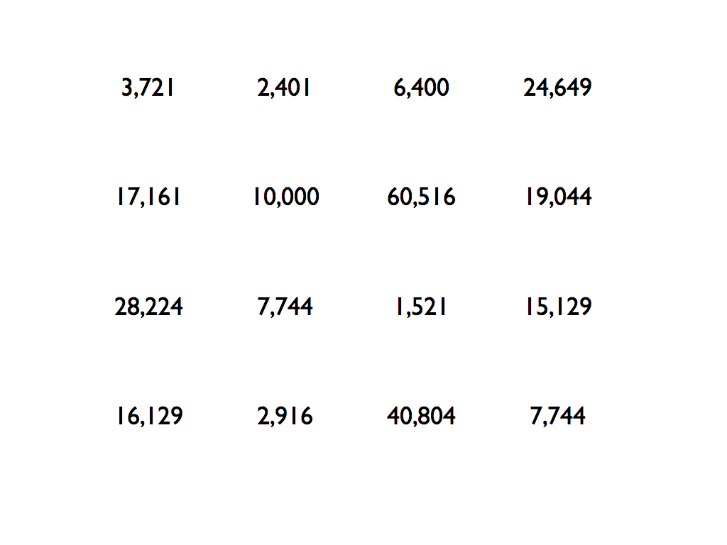
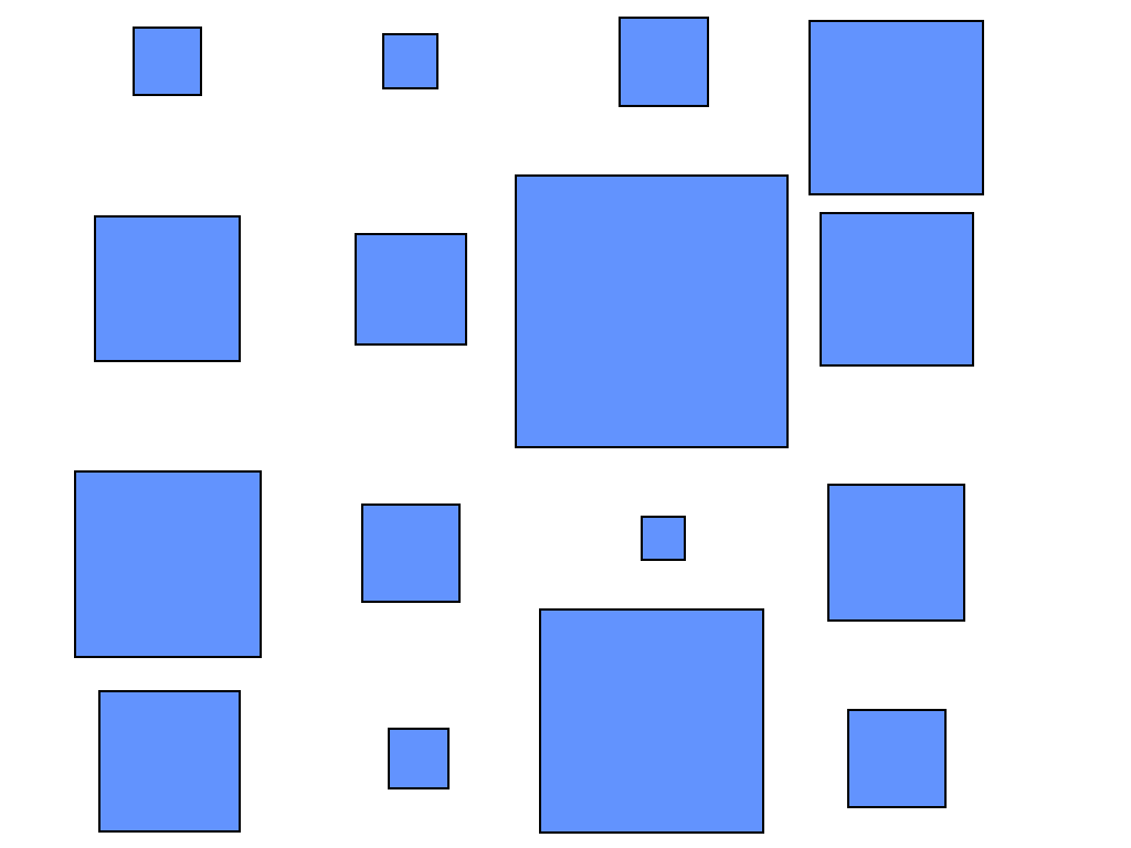
The numbers on this page represent the area in square pixels on the next slide. I used it to show how much faster you can pick out the largest and smallest values when they are visualized as shapes.
 I missed out on a good eye-chart sobriety test joke here.
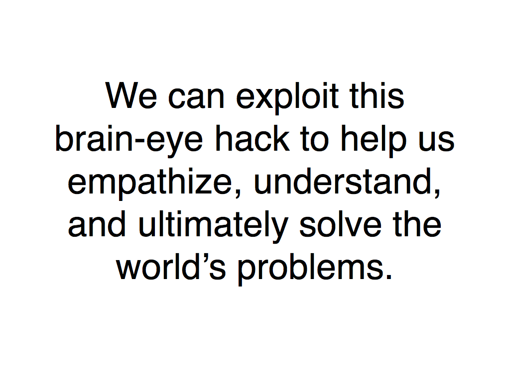
Hopefully at this point I’ve convinced you of the plausibility of why dataviz works from an evolutionary standpoint, and that we’ve been given this great gift of receiving and processing visual data. This slide is call to action. It says, “You have a superpower and you don’t even realize it. Let’s use it for good.”
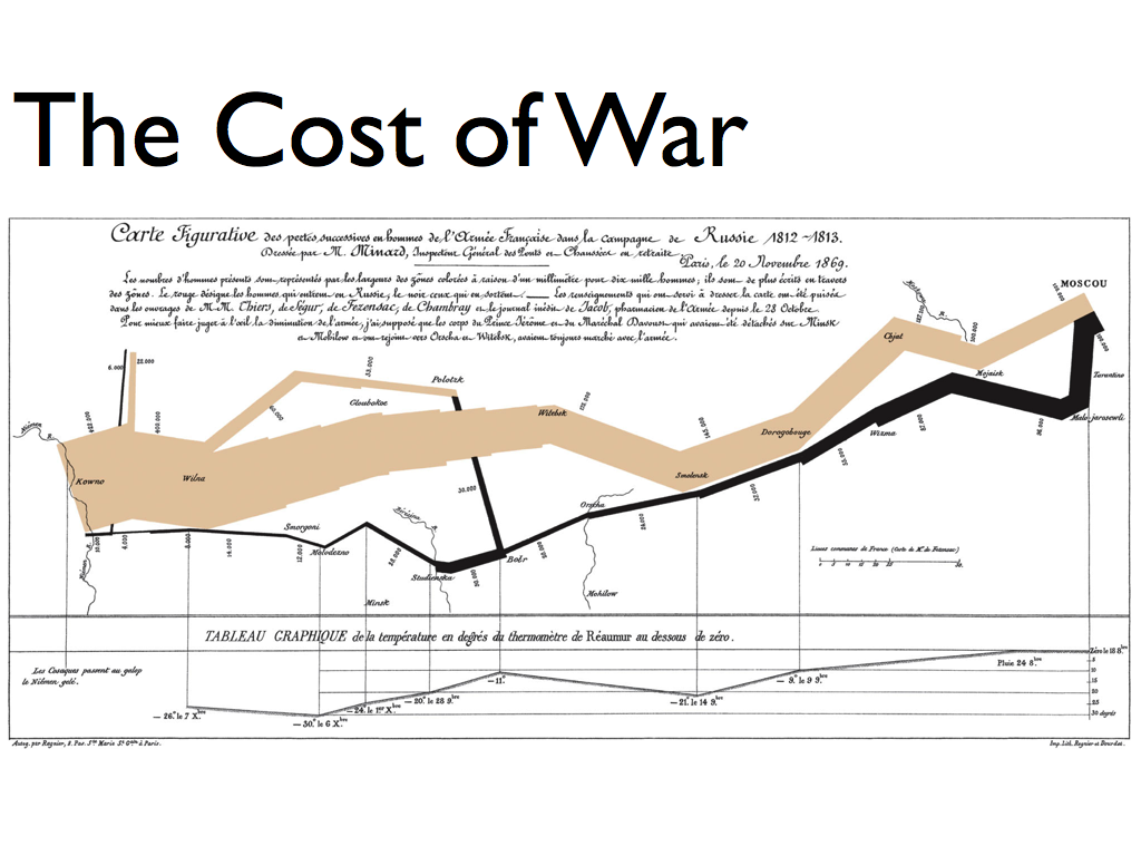
My whole talk was a just a way to show this slide to anyone who never heard of Minard’s masterpiece, Napoleon’s March. Seeing it inspired me to think more about what data visualization could be.

I needed more than 15 seconds so I took Pam Selle’s advice and doubled up on the slide.
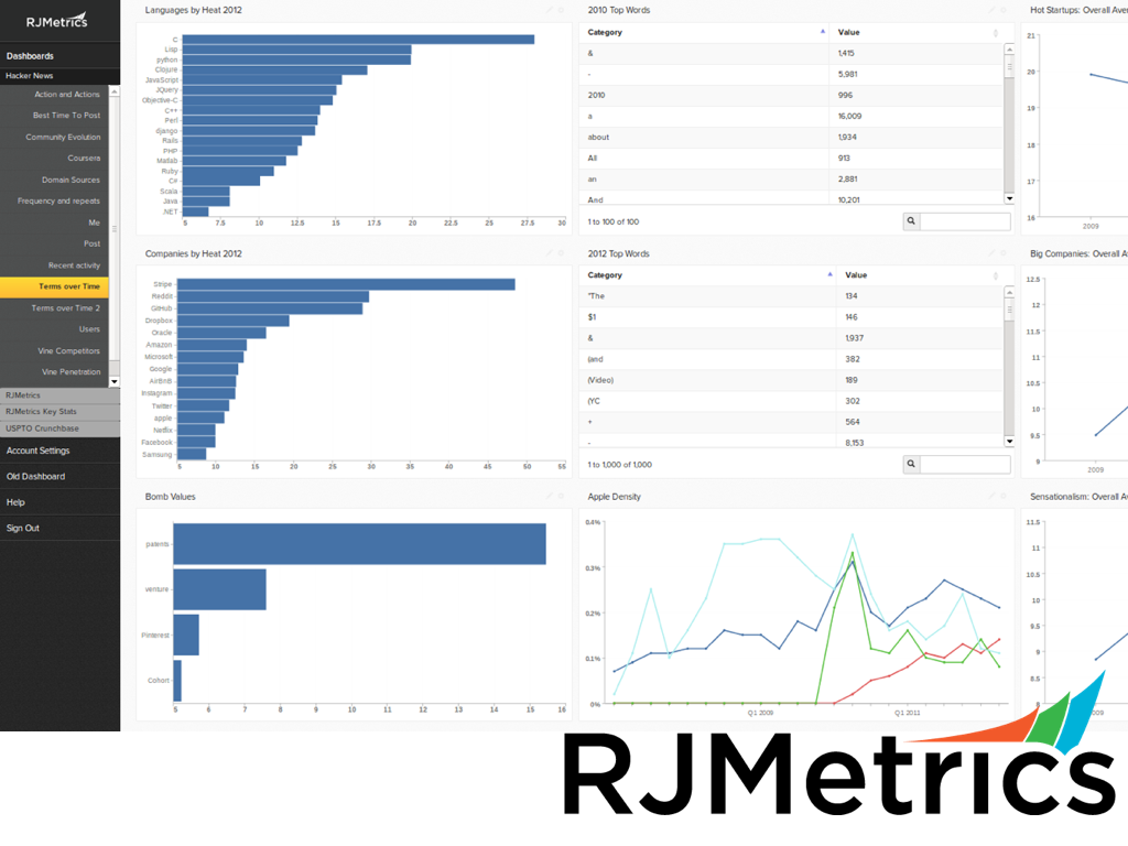
I probably should have disclosed that I’m working for RJMetrics now, but I only had 15 seconds to get through each slide! In fact, I actually have to start talking about this slide about 3 seconds before it shows up in order to make it through. It’s a picture of our awesome new UI we’ve been working on which should be out soon.

This is a screenshot from my macbook air’s terminal window. It only shows 0.0026% of the data in the Philadelphia General Fund Budget.

This is an exploded view of Mayor Nutter’s budget summary. I think he deserves a lot of credit (along with Mark Headd) for opening up the city’s data, but I wonder how many people read this summary.
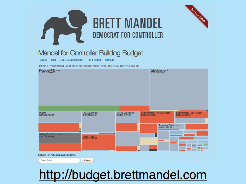
The infamous Bulldog Budget, powered by d3.js and a bit of Ruby and mysql. If you’re an advocate for open government and open data, you should really consider voting for Brett Mandel in the Democratic primary in May. Read what Technically Philly wrote about the Bulldog Budget in January.
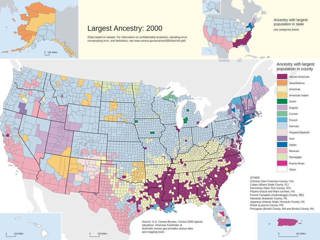
“Yeah James Miller!” I loved this map from the 2000 census and had no idea until recently it was by James Miller, brother of my friend and journalist Jen Miller. I think the woman chanting his name was just swept away by the enthusiasm of the night, but who knows?

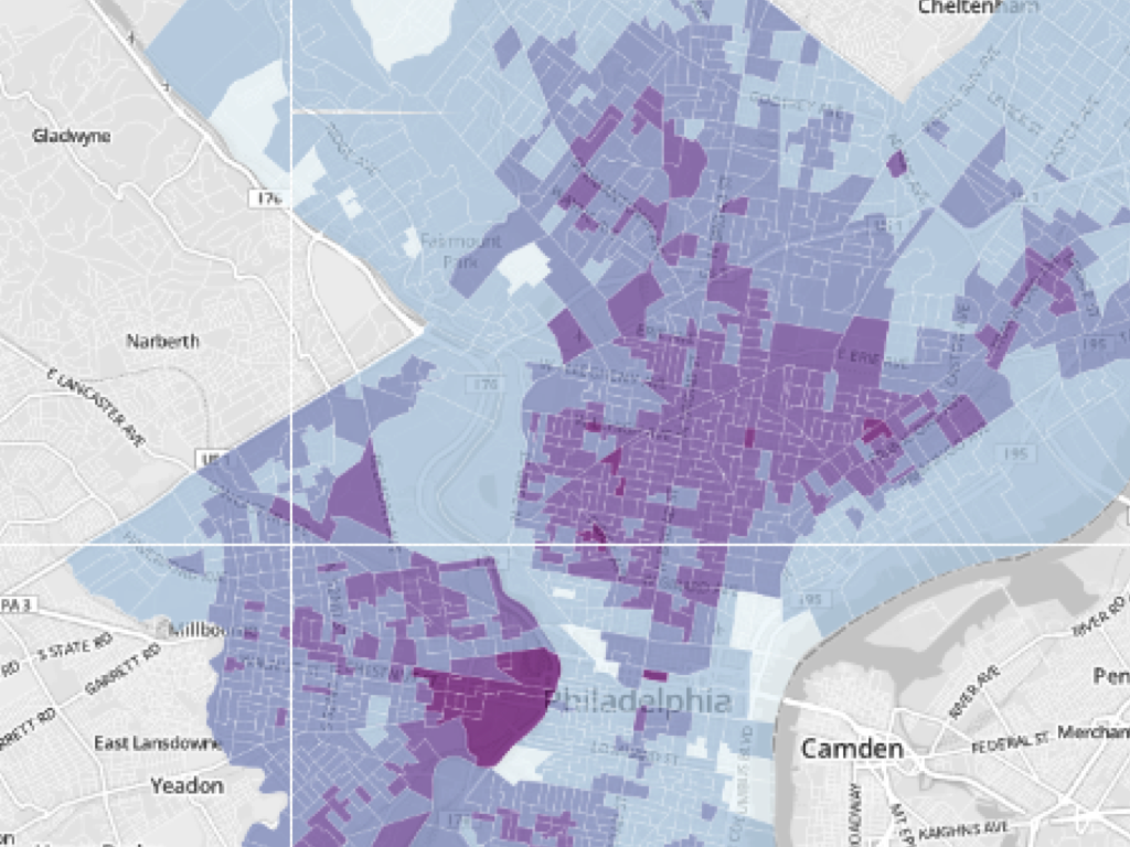
On August 14th, I stopped by Azavea to hear some guy named Mark Headd give a talk on open data. The same night, Casey Thomas, now at Axis Philly gave a presentation on an app that tracked voting records and lobbying expenses together. But it was Tamar Manik-Perlman’s map showing the impacts of Pennsylvania’s voter ID laws on poor Philadelphia neighborhoods that blew my mind. Here was the perfect case for how data visualization can help illuminate a problem. People like me and most of you reading this live in a world where getting an ID is not a problem. It’s difficult to imagine life being any other way. You can concede that maybe there would be some people affected, but seeing on a map that in some neighborhoods over 60% of voters could be impacted was shocking. I don’t know how much of an influence it had on the eventual delaying of the law, but it had a huge one on me.
I rehearsed this slide many times and just could not fit it into 15 seconds, so it got double duty as well.
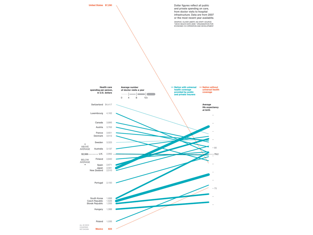
I originally had this image here, but I had to purge the sports visualizations. This slope graph is literally sickening. We spend twice as much for middle-of-the-pack results. The only downside was that I’m sure it was impossible to read on stage at Johnny Brenda’s. If you like it, check out this great article on slopegraphs.
I gave my conclusion over the next two slides and didn’t mention the content at all.
Seeing pictures of a devastated city make us more likely to help others and my conclusion was that data visualization taps into those same parts of the brain that motivate us. They create the will and courage to act. This is a tool we all posses no matter where you come from or what your education level is.
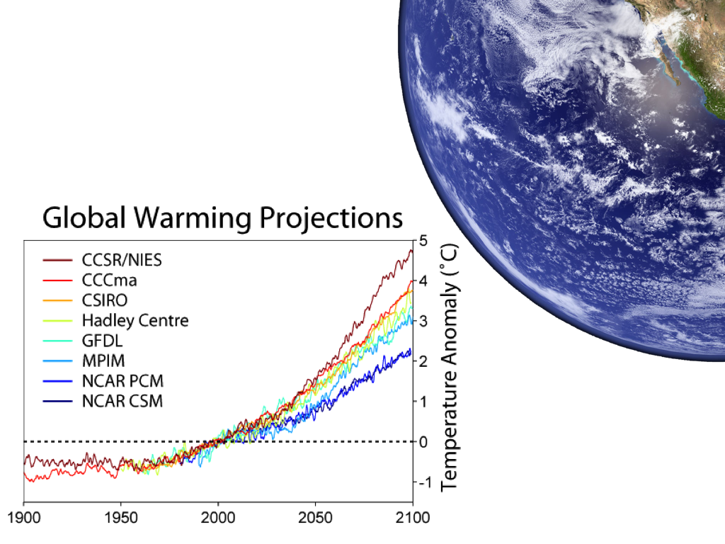
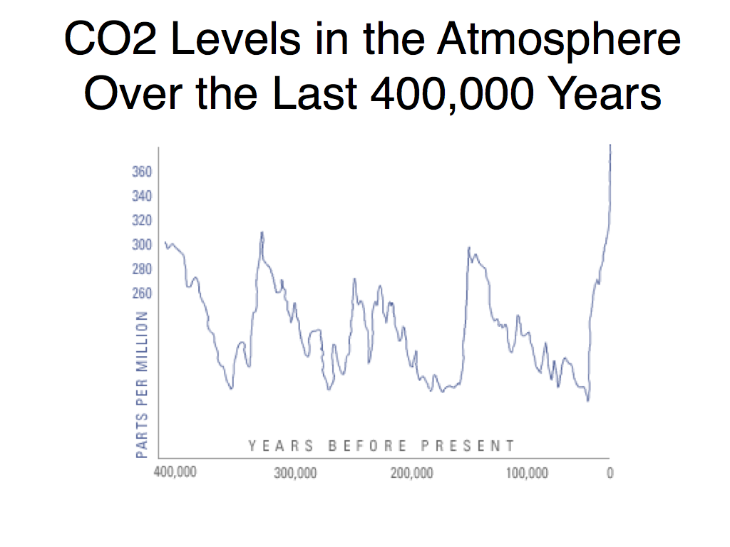
Admittedly, the last two charts could have looked a little better and I wish I had more time to either get better ones or recreate my own with the data, but I ran out of time.
It felt more powerful to just talk and let them speak for themselves and I think that was the right call.
I had an absolute blast and loved doing IgnitePhilly 11. The other speakers were fantastic so check out Technically Philly’s recap.
Leave a Reply